it looked exactly like that until like a year ago or something. steam is the only app i know that got updated like every single day and literally nothing changed in it for years at a time.
Valve is the master of gradual updates when it comes to the store front page.
Compare that to 2011 https://web.archive.org/web/20110228183210/http://store.steampowered.com/ It was fairly bare.
By 2014 they had populated the store frontpage with today’s deals added steam greenlight and a bunch of other things: https://web.archive.org/web/20140301022948/http://store.steampowered.com/ (You can even see Valve Merch on the right)
By 2016 they completely changed the theme and layout to feature the queue system and curators as well as advertise steam hardware: https://web.archive.org/web/20160317234818/http://store.steampowered.com/
2017 they made special offers larger to push sales: https://web.archive.org/web/20170930234049/http://store.steampowered.com/
Around 2019 they started promoting VR more by giving it its own front page section: https://web.archive.org/web/20190601001634/https://store.steampowered.com/ They lost their own hardware section
in 2020 They added it back: https://web.archive.org/web/20210801000113/https://store.steampowered.com/
2003
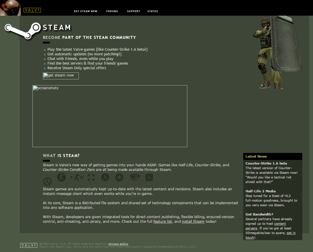
2004
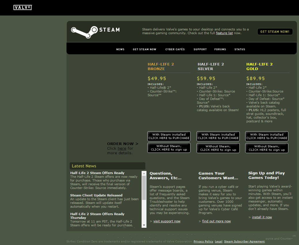
2005
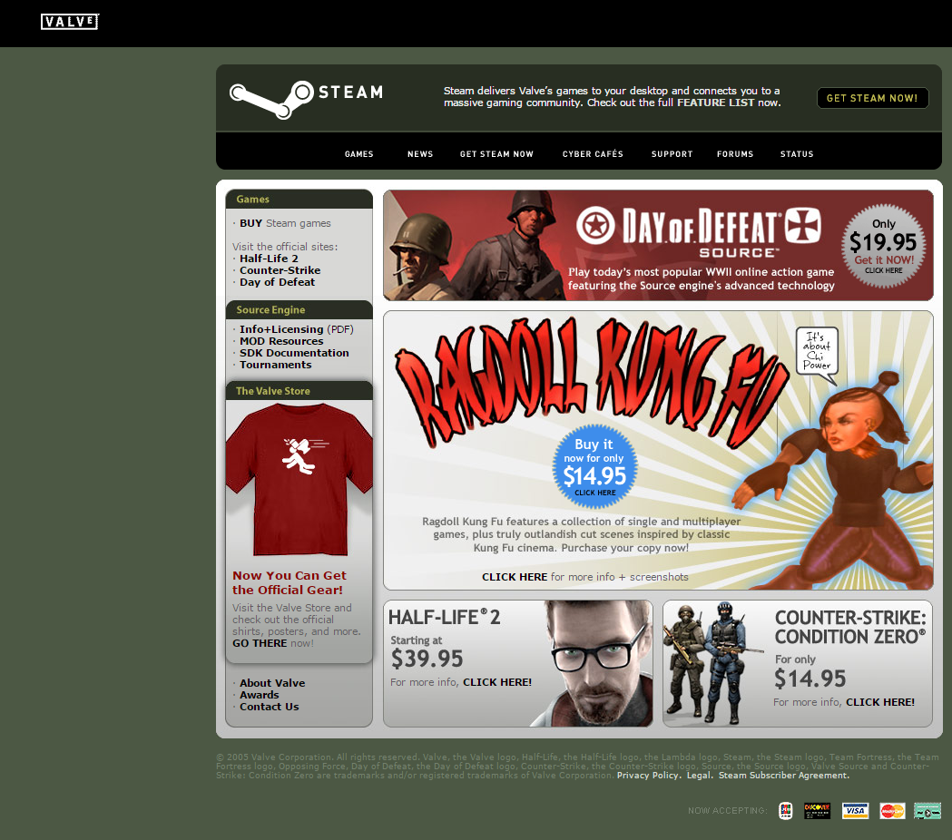
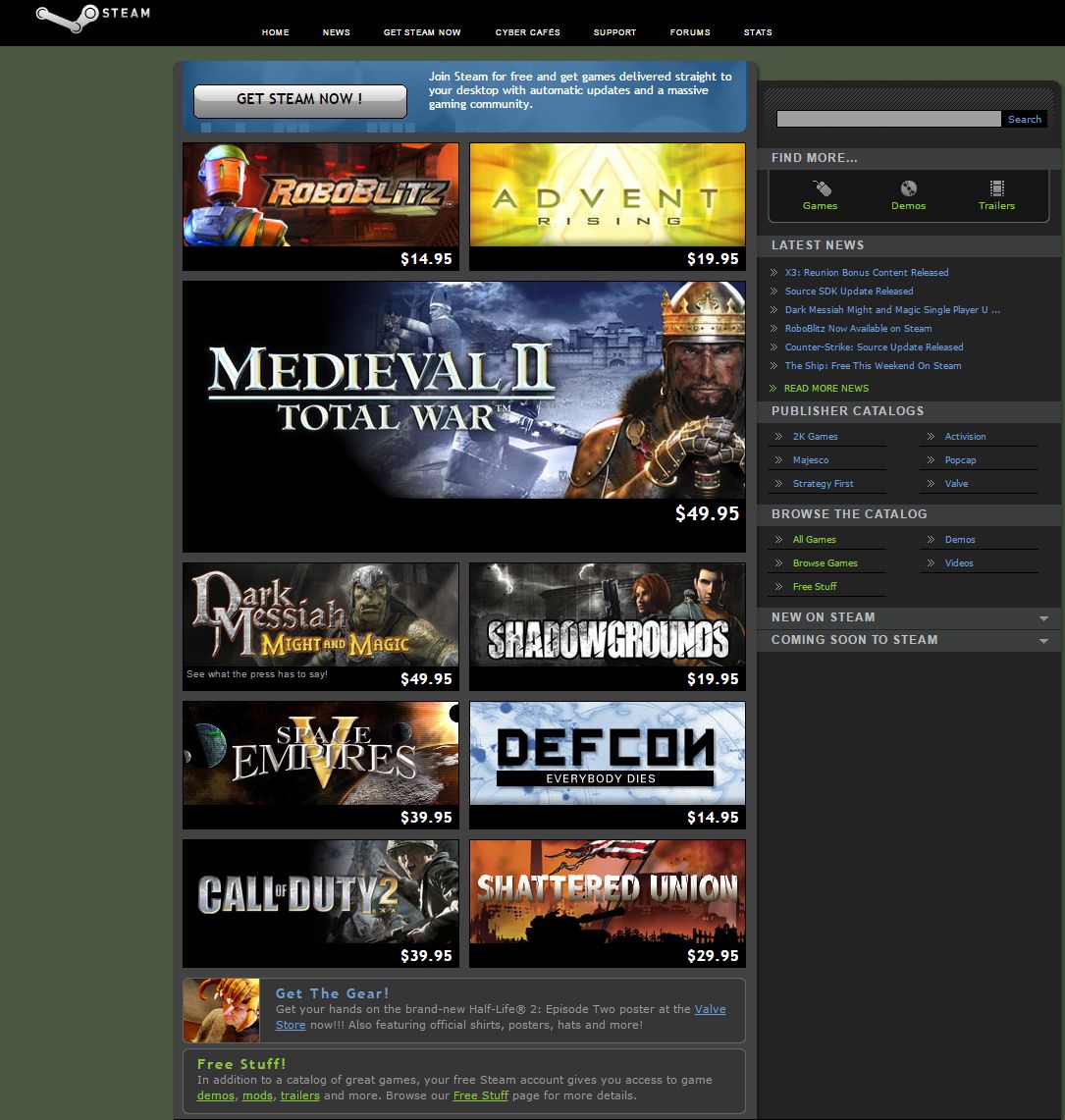
2007
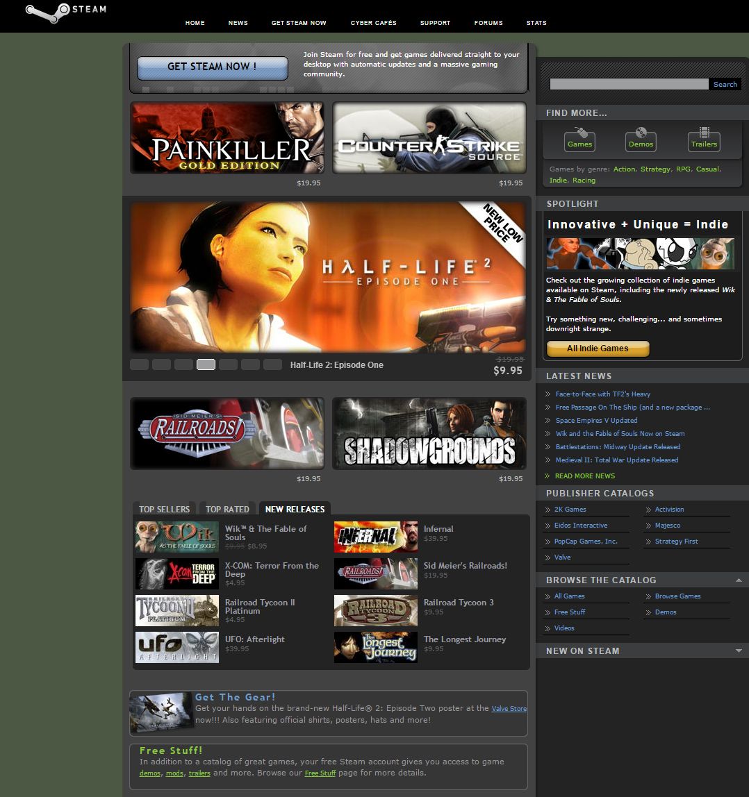
2008
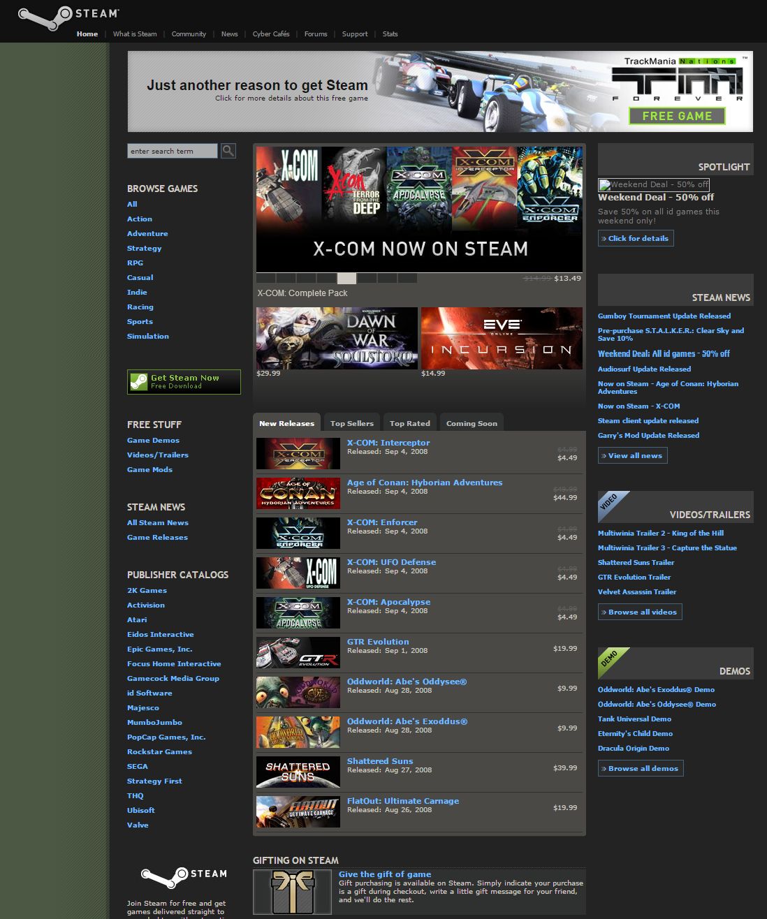
Really didnt change much visually huh?
i miss when steam was green

