What fonts are you currently using on your system? Which do you think is best for the terminal or for your desktop environment?
(updates) Ok I think I’m a fan of Ubuntu nerd fonts right now
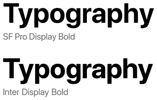
Inter for desktop and the nerd-font variant of JetBrainMono for Terminal.
+1 for Inter. Kind of reminds me of San Francisco :)
🟨 preview: Inter
Lol I re-discovered Inter about 10 minutes ago, I find it a little better than Noto Sans. (edit) I’m not really sure, maybe I’ve gotten too used to the Notos.
I’ve been enjoying Fira Sans and Fira Mono for far too long: https://mozilla.github.io/Fira/
Please don’t hate me but for desktop I use Segoe UI. After years of using it everything else looks just kinda off and cheap to me. Similar to when folder icons are not yellow
Nothing wrong with that! I prefer Inter for nearly all UIs these days, but I still think Segoe UI looks better than GNOME’s current default of Cantarell.
It is a well-designed system font. Say what you will about Microsoft but they do know how to make a good font or two.
I’ve been a fan of IBM Plex for a while now.
Sorry to judge them on this, but what an awful website!
The font is cool, though!
Ubuntu font. Idk why but I like it.
I agree! Nice memories of hitting backspace in a Linux Mint terminal and hearing that weird-ass BWOUP sound.
I recommend Ubuntu Mono for Termux users. Look at this black-background beauty – way better than the angly flat default
Iosevka.
Same. I’ve compiled a custom variant of Iosevka for terminal and code, because I want to have some chars in a certain way, especially the 0 and the & for even better readability. I used to have Monoid for code and terminal, but it the pixel perfect size for 12pt was getting too small for me and my eyes are not getting any better. Iosevka looks better even after some hinting by the OS.
On the rest of the desktop UI I use B612, because it is very ledgible, I recently switch over from the hyperledible Atkinson font. Before that I had Gidole on the desktop. Very pleasing, but not that readable at same font size.
Iosevka fits very well with East Asian characters, if you need those.
I find it narrower than I like otherwise, but I need Japanese characters often enough that I put up with it for my terminal.
Since basically forever I use DejaVu Sans for UI elements and DejaVu Mono for the terminal.
me too, I loved Verdana before I discovered FOSS and DejaVu Sans is basically FOSS Verdana
I always use Dejavu sans mono for terminal and programming too. I think its the best in terms of readability where indentation is important
Protomolecule for that scifi feel
As a huge expanse fan, I’m glad someone brought this to life! (Shout-out for the space the nation podcast if you like nerds breaking down the episodes and need a good back catalog for the dark winter days)
Protomolecule everywhere? 0.o
Scifi fonts remind me of old Rainmeter configurations. Wonder if Rainmeter ricing is still around
🟨 preview: Protomolecule

Except the terminal and a few other places.
While it’s very good looking, it’s not extremely practical with no difference (almost) between lower case and upper case letters.
For terminal/editor I went through CodingFont and ended up on Noto Sans Mono. Before that I used Source Code Pro for years. Both patched for nerd fonts, obviously.
I wish to put in a plug for Noto Sans Semicondensed for spreadsheets, although not generally for system-wide use.
I recommend it for my Tonto2 List Maker script, which uses a spreadsheet layout. Noto Sans Semicondensed has “tabular figures,” which means you can use it in tables to align digits and decimals with simple spaces and still have the look of a proportionally spaced font for text.
Noto Sans Semicondensed is available from Google, of course, but Linux Users will be more likely to install the fonts-noto-core package.
I’ve been using Source Code Pro for a while now. Might not be the best, but it does the job for me.
Gohu Font Nerd is a nice small bitmap font I’m fond of. Only issue is the size for high DPI monitors, but the JetBrainsMono nerd font is a nice vector font that’s easy on the eyes (quite stereotypical/cliché, but that’s for a reason).
Dropping a link for others since it’s the first time I heard of it.
Interesting. What makes you use bitmaps as a system font?
Gohu:

I get it for TTYs. Though for TTYs nothing will take me away from Terminus :]
What makes you use bitmaps as a system font?
I like the aesthetic of bitmaps. Personal preference
Personally, whatever is default.
I know that may sound weird, but I’m a huge fan of sane defaults that I don’t even notice are there.
Hack nerd font is my go to for terminal use.
U001 is my main system font as a clone of Univers. Monospace is Berkeley Mono—it might be paid/proprietary but boy does it look nice & was an upgrade from several years with Iosevka. JuliaMono is its fallback though since I use Unicode with frequency & Berkeley doesn’t cover all the symbols I use.
The important part is if you care anything about your fonts, you won’t destroy them by patching in that uncurated hodgepodge called “Nerd Fonts” clobbering used symbols or the wrought-with-false-positive “coding ligatures” which is not how ligatures are supposed to be used but programmers refuse to demand Unicode support in their languages to fix the problem.
U001 is new to me, so here’s a link for others to look it up.
The license is Aladdin which is kinda predates GPL but allows free usage if you aren’t shipping the font with your own competing paid software.