Masimatutu@lemm.eedeleted by creator to Data Is Beautiful@lemmy.ml · 3 years agoEvolution of recorded-music revenue over the last 50 yearsfiles.mastodon.socialimagemessage-square55linkfedilinkarrow-up1425arrow-down115file-text
arrow-up1410arrow-down1imageEvolution of recorded-music revenue over the last 50 yearsfiles.mastodon.socialMasimatutu@lemm.eedeleted by creator to Data Is Beautiful@lemmy.ml · 3 years agomessage-square55linkfedilinkfile-text
minus-squareguylacaptivite@sh.itjust.workslinkfedilinkarrow-up3·3 years agoProbably because they wanted to show the variance over time which one pie chart cannot visually show. And it’s easier to compare a circle vs a circle than a pie chart.

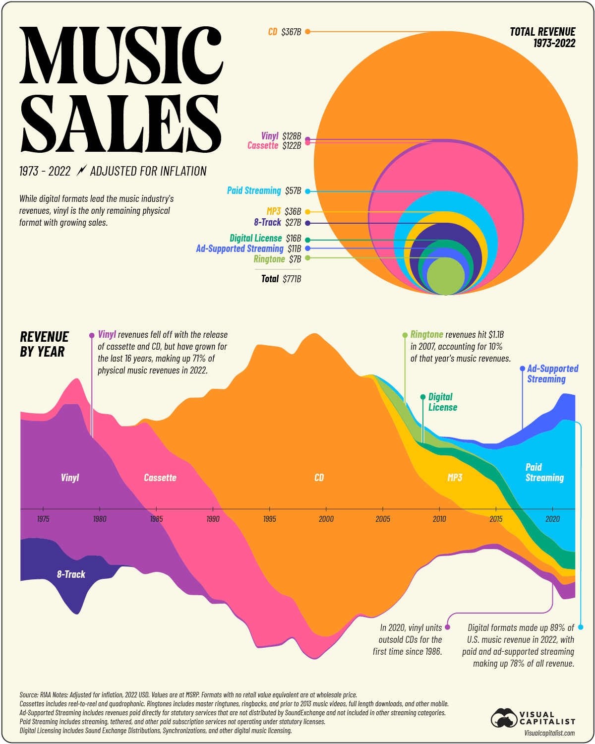
Probably because they wanted to show the variance over time which one pie chart cannot visually show. And it’s easier to compare a circle vs a circle than a pie chart.